Willo Labs Site Redesign
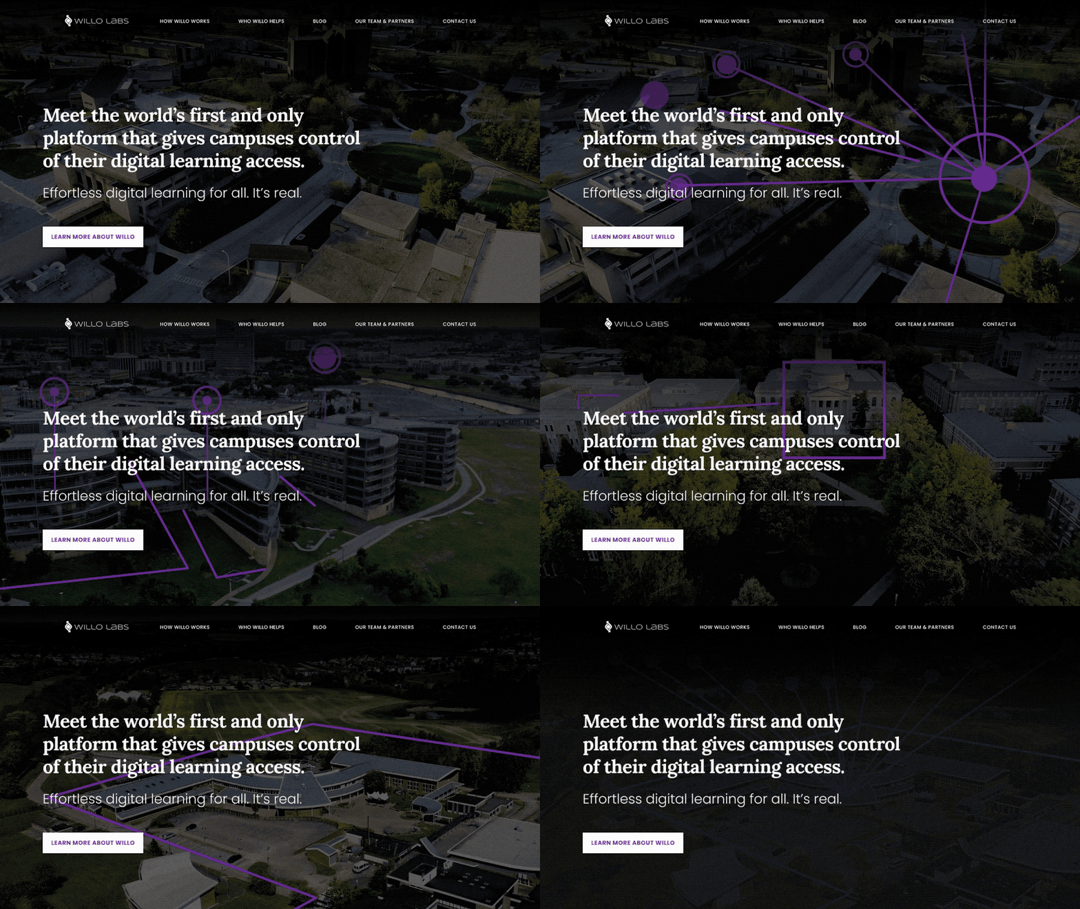
A redesign of the marketing site for Willo Labs, which is an educational service provider for both primary and secondary schools. They work as an intermediary between educational content providers and schools, providing a simple way for students, teachers, and administration to access the content they need. An easy way to think of it is like how Roku works - a portal where a user can access content from multiple providers. And for Willo Labs they needed a new marketing site that improved and expounded on their previous one.
YEar2022
Roles & ResponsibilitiesUX Design / Visual Design / Motion Graphics / Illustration
Color palettes and design systems
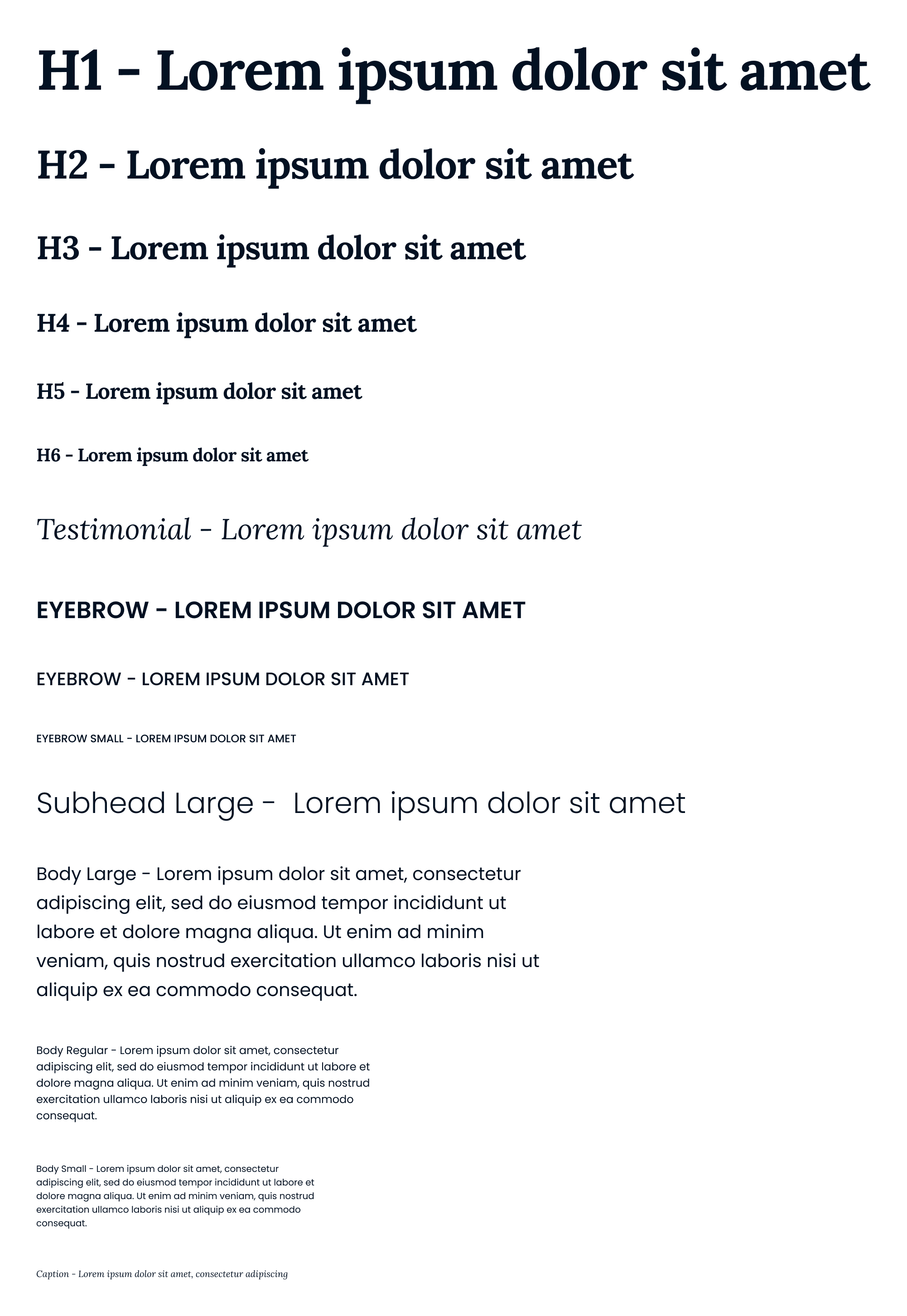
In addition to designing out the layout and content of this new site, a design system was also made and implemented, to give this more expanded site a cohesive feel across pages. Willo previous to this site didn’t have much in the way of branding, so several rounds of explorations were done.
As I worked on colors and type styles, imagery styles were also explored. Wanting to draw a line between feeling like a forward thinking tech company and retaining the friendlier feel of an educational company, a mix of photo collage and vector graphics was employed.


